Every book needs a cover. Otherwise, it’s just a bunch of pages with words bunched together. [Yeah, yeah, I’m sure there’s some definition of “book” that doesn’t include any details about a cover, but … work with me here, ok?] And the cover of most (modern) books isn’t just the title and what-not, but also has cover art.
No matter what anyone says about “not judging a book by its cover”, trust me – it’s kinda what you (as a reader) do. If the cover art is drab and dull, if nothing else, I’m certainly less likely to even take a look at it. That isn’t to say that a good book could have a bad cover (or vice versa), but the cover art should be relevant and somewhat eye-catching.
Since I started writing the book, I had a pretty clear image in mind of what the cover would (should?) look like. Open up your imagination and work with me here to start picturing it…
Cover Art Description
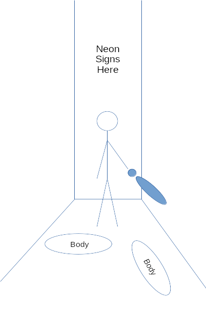
The image is of a dark alleyway, at night, in Osaka. The picture is taken from “deeper” inside the alley looking out towards the “main” street the alleyway connects to. The main street is lit by the neon lights of Doutonbori (perhaps something iconic, or just with some sort of “obviously” Japanese signage, etc., to make it clear it’s in Japan). The lights, though, are not making the alleyway bright.
Standing inside the entrance to the alleyway (a few feet from the street entrance), facing towards the street (so – away from the viewer’s perspective) is a woman, looking forward (so all we see is the back of her). For sizing / perspective, she is approximately 1/3 of the height of the overall image (and approximately centered on the cover).
She is wearing a knee-length (or slightly longer) Western business-skirt and either a matching women’s blazer or a blouse of some kind. She stands defiant – legs spread slightly. her left arm hangs at her side; her right arm is also hanging down, but at an outward angle (perhaps “4:30” on a clock face), and holding a baseball bat. At her feet, behind her, are two bodies – dressed in jeans or dark sweat pants and t-shirts – facing away or face down. They have clearly just lost whatever fight happened here.

That’s it – that’s the cover art. [And, if you hadn’t figured it out – the woman is Kitamora-san. This scene does not appear in the book at all – but it’s a pretty clear representation of what’s in the book, I think.]

